
FuraiBo
FuraiBo


Project: Responsive Design, FuraiBo Restaurant Website
Role: UX Designer
Tools Used: Figma, Miro, Zoom
Introduction • About FuraiBo
FuraiBo
FuraiBo is a small local izakaya Japanese restaurant that offers authentic Japanese dishes. Although the structure of the restaurant could use some updates and it’s fairly small, the dining space has such a warm cozy traditional vibe to the place that makes it feel like you’re in Japan enjoying a home cooked meal. They have optional table seating or traditional tatami seating, which is a soft mat placed on the floor to sit on that is traditionally known in Japan. It is a place where you can enjoy the taste of authentic Japanese closest to home.
Inspiration
Even though the place is fairly small to accommodate a large number of customers, I believe they can expand and also upgrade their restaurant if they were able to bring in more revenue. However, I believe their minimal promotion and outdated, unpolished website design as well as a lack of mobile responsive design, FuraiBo is not reaching its full potential in providing customers a positive simple user experience.
This led me to want to redesign FuraiBo’s Restaurant website and create a responsive design to reach it’s full potential by creating a positive user experience to boost revenue and improve customer satisfaction.
Approach
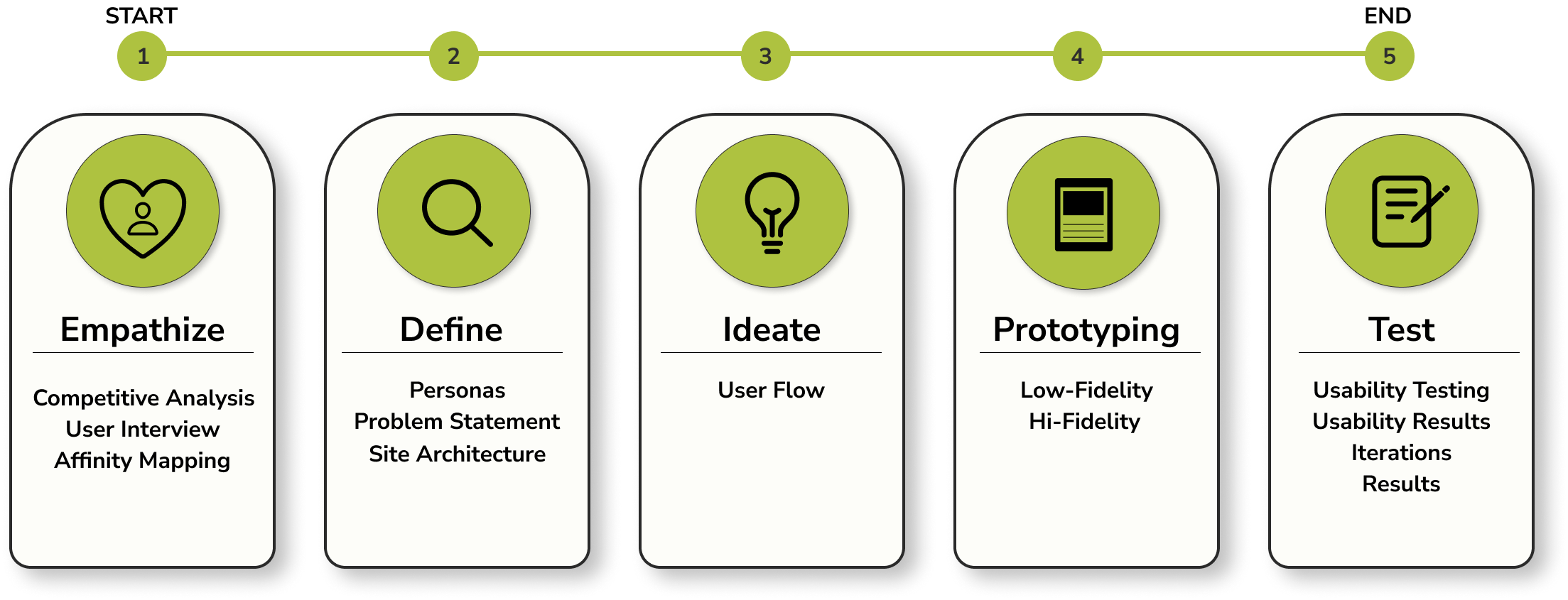
Emphasize • To understand the user, their needs, and their problem

Focus
The goal was to determine users' needs from FuraiBo’s website to identify the necessary improvements that need to be made.
Objective
Determine which features on a website help make it easy when ordering takeout or making reservations.
Determine what other features on the website would help users have an easier experience.
Determine which areas of this website need improvement.
Discover how little or often the user uses the restaurant's website and understand why.
Research
Using FigJams competitive and secondary analysis template, I discovered many of the websites
Have some similarities:
Provides information to contact the business
Offers social media platform connected to their website
Offers menus online
Provides a map of their location
Differences are:
Only 1 website offer an image for each dish
Provide access to making reservations online
Some companies offer rewards or discounts if they follow their social platform
Only some websites offer online order for takeout
Opportunities are for FuraiBo’s Website:
Offer online reservation
Post current promotions
Offer loyalty incentive to have long term customers
Fix online takeout order
Competitive Analysis
Secondary Analysis
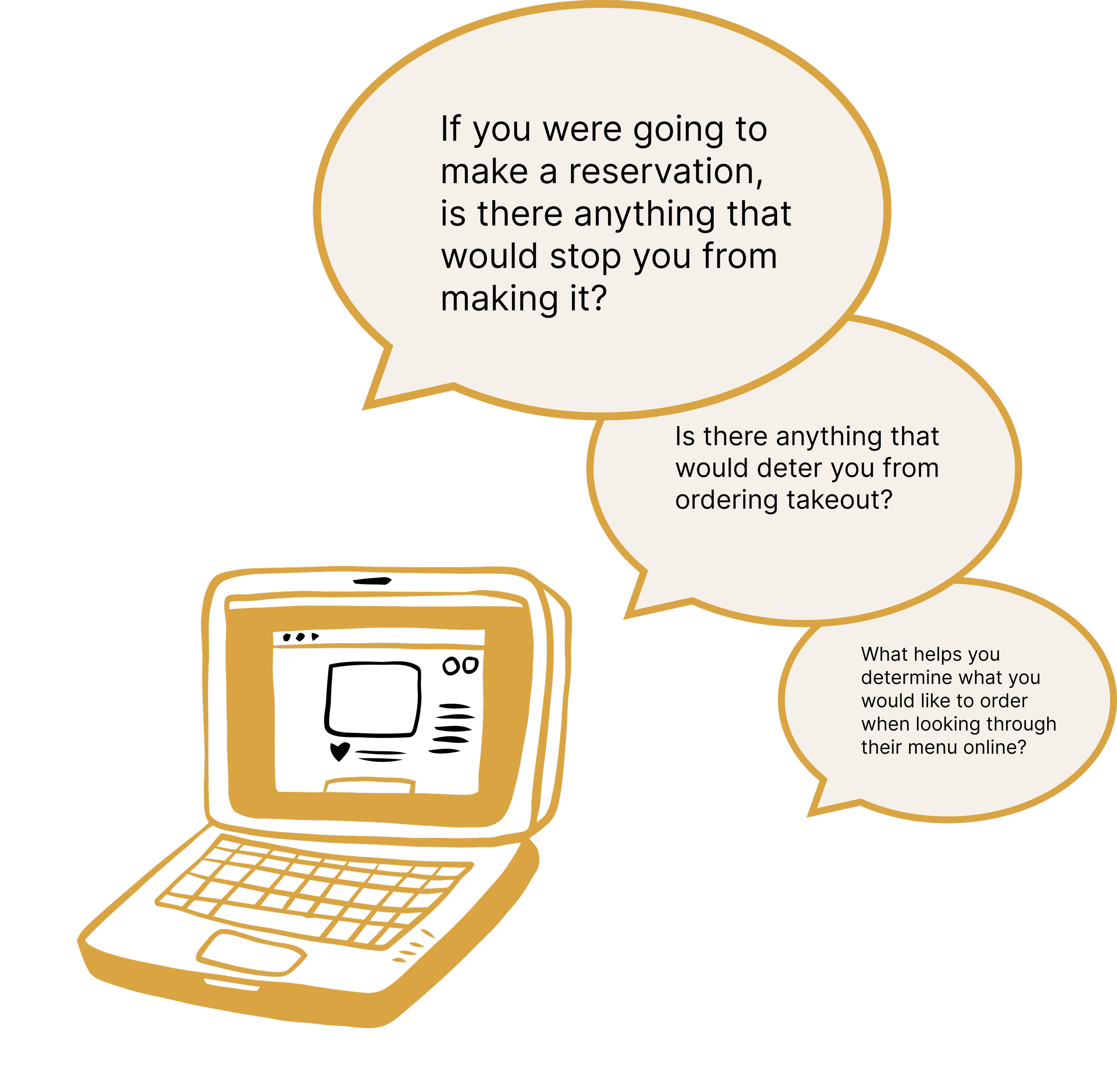
User Interviews and Surveys
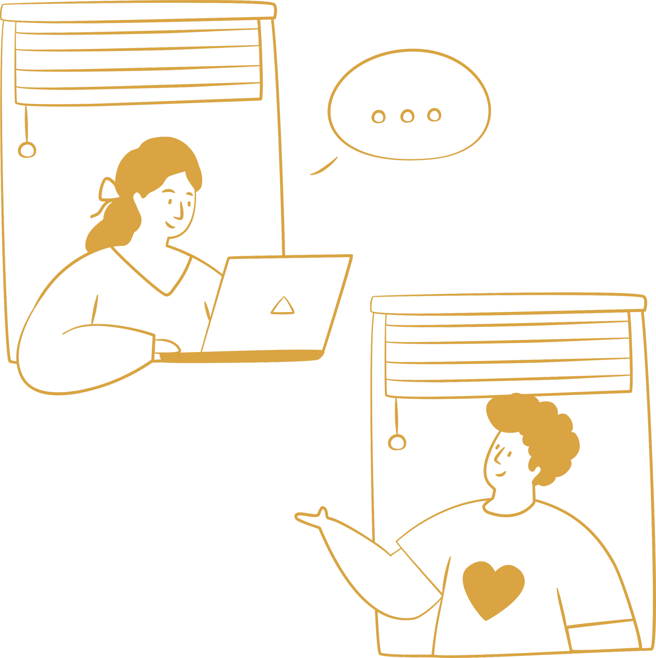
To determine users' needs from Furaibo’s website to identify the necessary improvements that need to be made, I carefully crafted interview questions to gather as much information as I can to see if there are any common themes.
Participants
We interviewed 5 participants in person in the following categories, being sure to include a range of age ranges 18+ or older, genres, and ethnicities in our target industry.
People who live in the area that have dined at Furaibo or who are able to eat there.
People who typically browse through a restaurant's website to see what they have to offer.
Affinity Mapping
After gathering all of the data from user interviews and surveys, I categorized the data using affinity mapping.
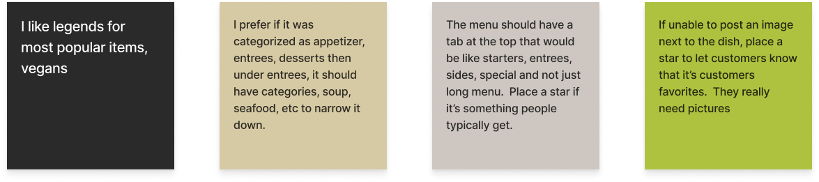
Menu Preference
Efficiency and Time

Accurate/Updated Honest Reviews and Information

Communication Errors/Issues
Choosing a Dish
Importance of Reviews, Credibility, and Social Media

Key Findings
Important To Users
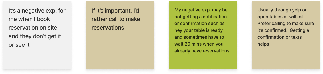
Easy access to make reservations and receive confirmation
Ensure the restaurant receives the correct takeout order
Avoid any communication errors
Save time and efficiency is important
Importance Of Social Reviews
Most participants rely on social reviews to assess a restaurant’s quality or a restaurant’s dish.
Many prefer platforms like Yelp, Google Reviews, and Instagram for this purpose before deciding where to eat or what to order.
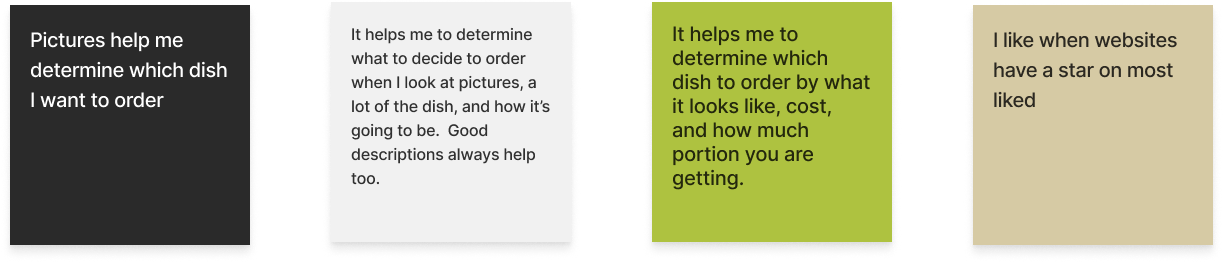
How A Menu Is Presented Plays A Big Role
Users appreciate clear images of the dish and detailed descriptions of the food
Well organized layout of the menu that makes it easy to browse
Accurate/Updated Reviews And Information Are Important
Updated price and menu
Full price transparency
Correct hours of operation
Define • Synthesizing research to define the problem…
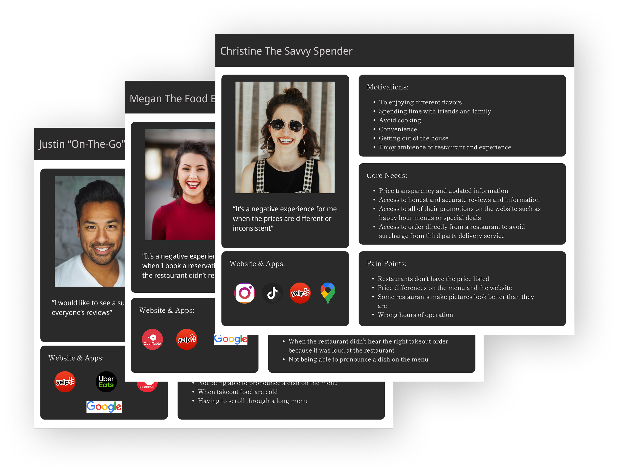
Personas
After research, this led me to 3 personas to know who the target users will be to effectively redesign FuraiBo’s website keeping these personas in mind.
Christine, the savvy spender who strives to get the most value for her money by choosing restaurants she trusts to provide satisfying takeout experience
Megan, a food enthusiast frustrated by errors in processing customer requests
Justin, on-the-go, who is extremely busy and wants a quick east way to order and navigate through a menu with all of the information needed rather than spend extra time on social media and other platforms
Problem Statement
POV 1
I’d like to explore ways for food enthusiasts to avoid customer request processing errors since discrepancies with their reservation and takeout order can negatively impact their experience with the restaurant.
HMW 1
How might we redesign a website to avoid customer request processing errors?
POV 2
I’d like to explore ways I can help users who are looking to save time, have a simpler time deciding on a dish as they often spend other time on other websites to look at images and read reviews to decide on a dish.
HMW 2
How might we categorize and redesign a menu?
POV 3
I’d like to explore ways users on a budget have access to honest, accurate, and up-to-date information on a restaurant since they often get frustrated with misleading/incorrect information which can negatively affect their experience and potentially waste their money.
HMW 3
How might we give users easy access to honest, accurate, up-to-date information?
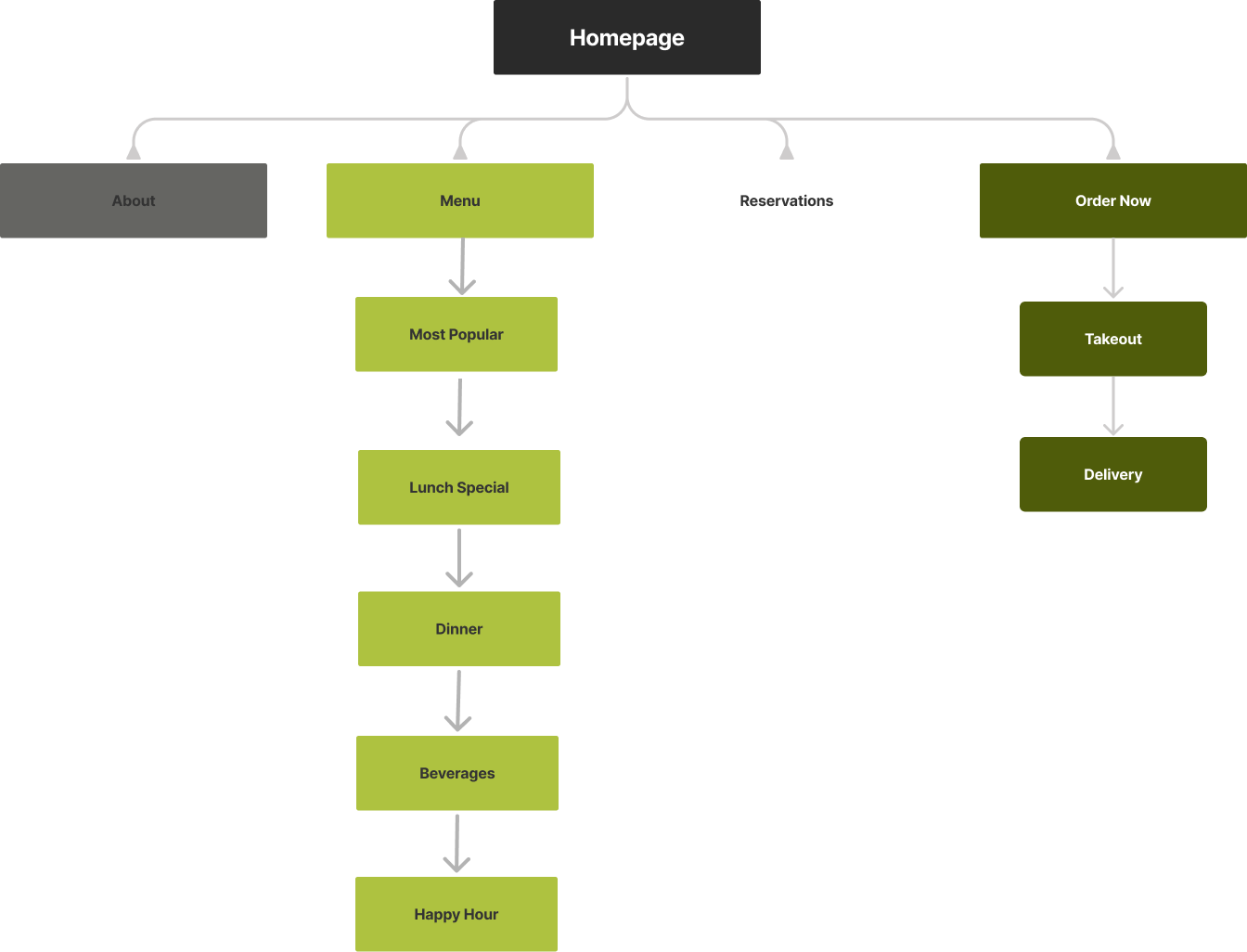
Site Architecture
After reviewing other restaurant websites, it was clear to have a primary navigation consisting of Menu, Reservation, and Order Takeout. However, FuraiBo’s website had an excessive number of primary navigation items which were unnecessary. Some of the content under the primary navigation could instead be added directly to the relevant pages .
Changes made:
Eliminated Login and Contact Us (moved contact information to the homepage and About).
Organized the secondary buttons under Menu to users preference based on the interview
Ideate • Brainstorming and generating solutions to help those needs…
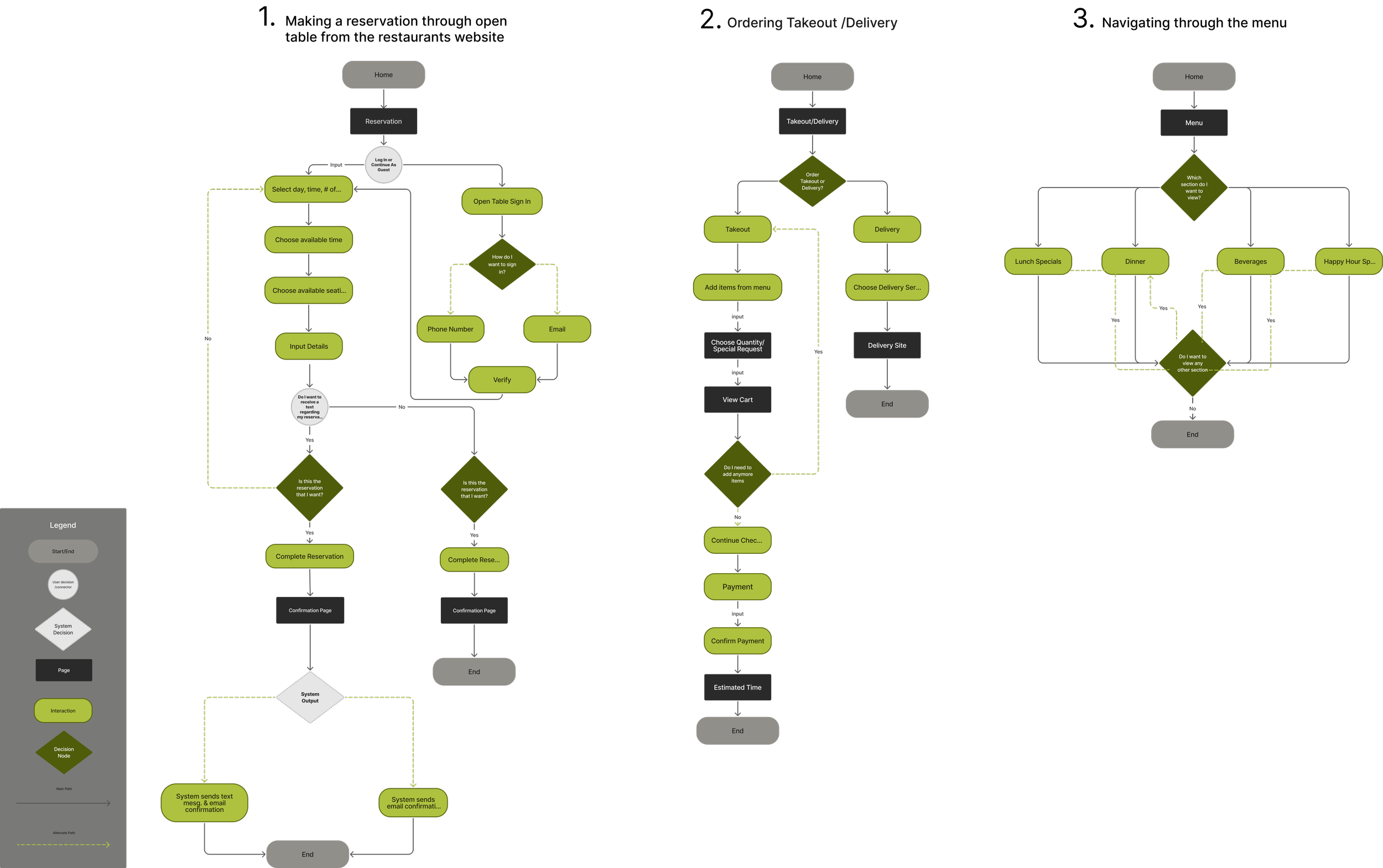
User Flow
To understand how users will interact with the website, a user flow was created for the following to show the paths users will take when completing tasks:
Making a reservation through OpenTable from FuraiBo’s restaurant website
Ordering Takeout/Delivery
Navigating through the menu
Prototype • Create wireframes and prototypes to visualize solutions…
Lo Fidelity Sketches
Low fidelity frames were created by sketching different screens for each key unique screens.
3 different screens for the home screen
3 different screens for the menu
2 different screens of Open Table reservation pop up


Redesign
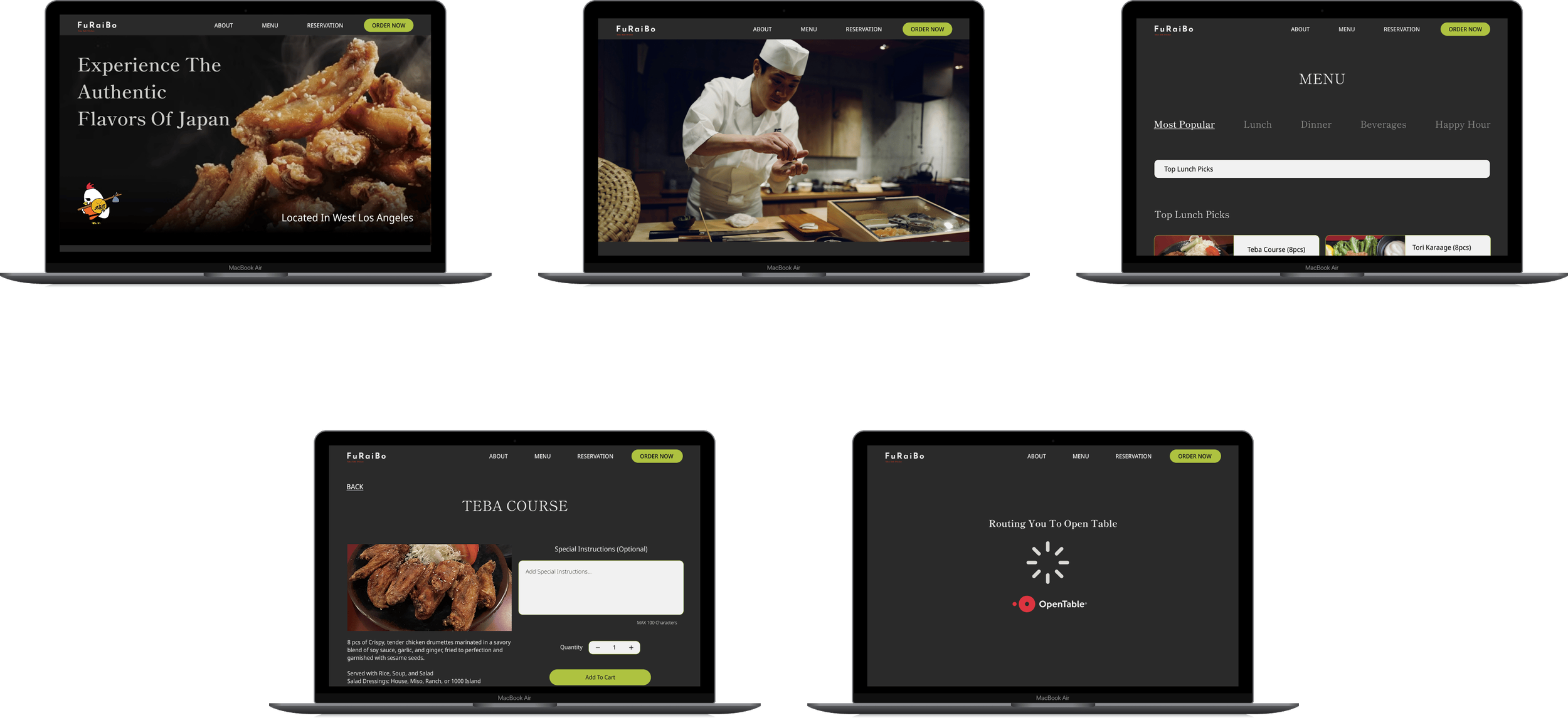
5 key screens for desktop has been redesigned from the original website and 5 key screens for mobile responsive design were created. Some of the desktop and mobile screens differ from each other, as the task flows that were intended for testing on mobile didn’t require some of the key screens made for the desktop version.
Desktop Version

Mobile Version

Testing • Validate designs through user testing
Usability Test & Results
I conducted a usability test through zoom involving 4 participants from the initial interview and 1 new participant to complete 2 task flows. I measured data using quantitative and qualitative metrics.
Task 1
Ordering a specific item for takeout and then proceeding to checkout
Results:
All participants were able to quickly and easily navigate through the takeout order process
The only minor mishaps which occurred when asked to go to the homepage, three participants initially went to the hamburger menu but quickly navigated to the logo once they realized the hamburger menu button wasn’t interactive
1 participant noticed that the most popular section of the menu wasn’t clear enough to see whether the items were from the lunch or dinner menu
Task 2
Navigating through the menu, then starting a reservation
Results:
All participants were able to complete the task quickly and easily by navigating through the menu but one noting confusion on the items under Most Popular on whether it is lunch or dinner
When looking for Yakitori under Dinner, 3 participants used the drop down menu to go to find the sub category, and the other 2 scrolled all the way through the menu to find the item which was expected that participants would navigate it differently as the option was provided
All participants easily found the reservation button while looking at the menu
Iterations
After collecting and analyzing the usability test results for the mobile design, I implemented iterations based on two levels of priority. I also made necessary changes to key desktop screens based on the usability testing feedback from the mobile design.
Priority 1
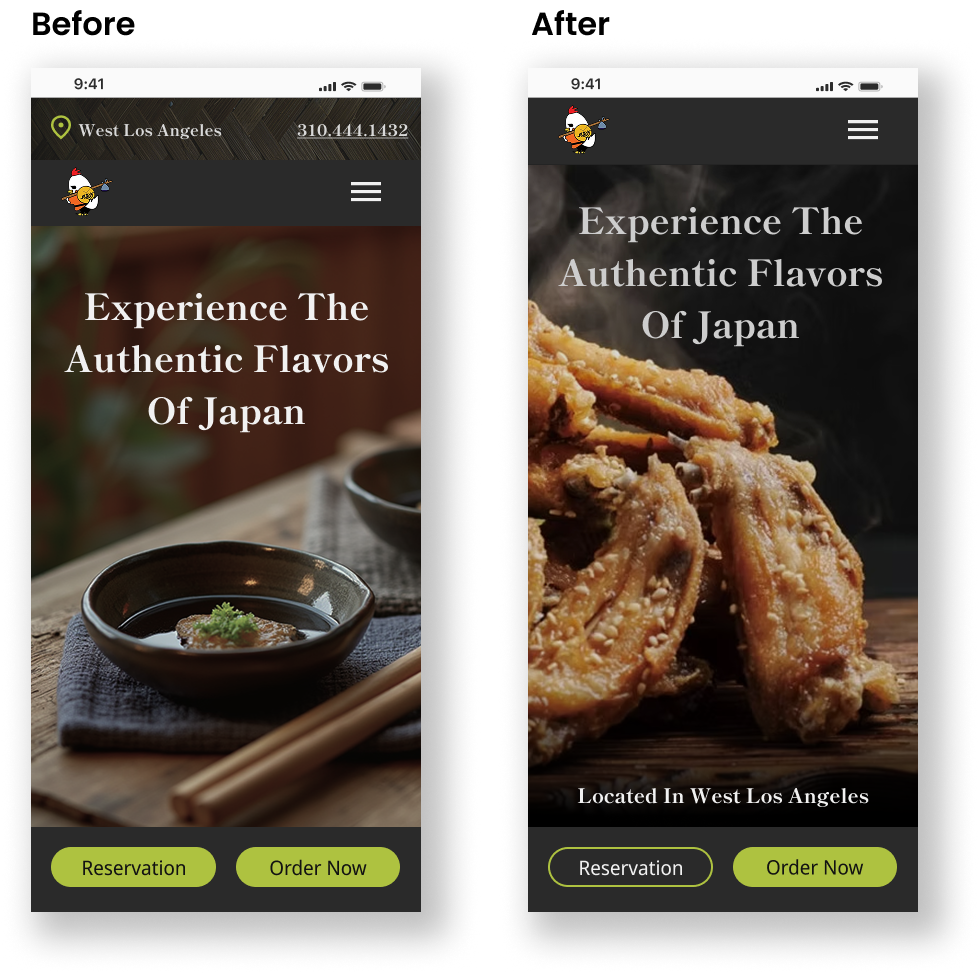
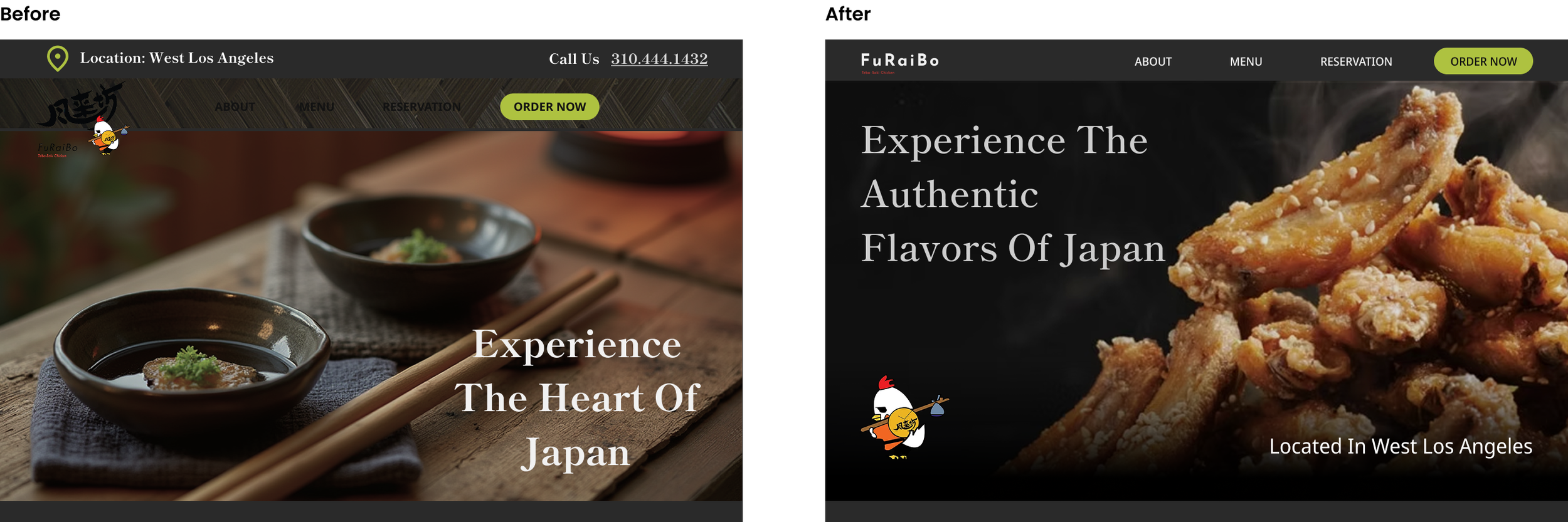
Hero Page:
Hero image has been changed to highlight Teba-Saki wings since that is their specialty
Reservation Button:
The reservation button has been changed to secondary button to not overwhelm the users
Banner For The Location:
Removed the banner with location and phone number. “Call Us” will be under the hamburger menu under reservations. Location info was moved to the bottom of the hero image.
Priority 2
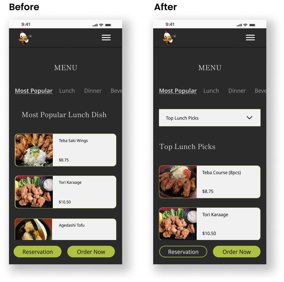
Most popular menu:
To improve clarity and to emphasize whether the items under most popular are lunch or dinner, I added a drop down menu under Most Popular.
Expanded the Most Popular Menu and changed the subtitles to “Top Lunch Picks” and “Top Dinner Picks”.
High Fidelity After Iterations
With clear changes that needed to be made after usability test for easy navigation through the website, here I have the final results.

Results
Next Steps
Now that the high fidelity task flows has been tested and iterated, the next steps would be:
Include the rest of the items served at the restaurant.
Add the site architecture under the hamburger menu and add screens for the delivery section.
If time and resources are allowed, I can test the new screens to ensure easy flow and make further iterations if needed.
Reflections
The key takeaway I gained from this experience, is the more data you have, the better understanding you have to really see the bigger picture of what our personas need. This project also helped me learn to manage my time a little better. Now that I have a better idea of how long the process takes, I was able to move along a little faster with the project as well as manage my time properly. I was also able to work on the project a little more independently which was a great feeling.