
Venmo
Venmo

Project: Add a Feature, Venmo App
Role: UX Designer
Tools Used: Figma, FigJam, Zoom
Duration: 4 Weeks
Introduction • About Venmo
Venmo
Venmo, a fintech company, is a mobile payment service that allows users to send and receive money. It also incorporates social features when making peer to peer transactions and allows for merchant payments, banking, and cryptocurrencies.
Inspiration
Venmo’s split group payment feature is helpful, but it has its limitations and doesn’t fully address a common issue in both social and business scenarios. One common problem with splitting the bill are the discrepancies in what each person contributes. Additionally, the lack of transparency can lead to unclear breakdowns or surprise costs. It can also be challenging to divide the bill evenly or fairly, which often leads to debates about the details of each financial obligations, the length of time it takes to calculate the cost, or confusion over how to divide the cost.
While Venmo has seen consistent growth over the years, there is an opportunity for Venmo to attract new users or retain usage of ongoing users by adding a feature that can help customers solve a common problem when splitting the bill. This feature would allow designing and implementing a feature that allows users to split their bill through Venmo using transparency. I believe that this feature can solve a lot of issues that arise from splitting the bill among peers.
Approach
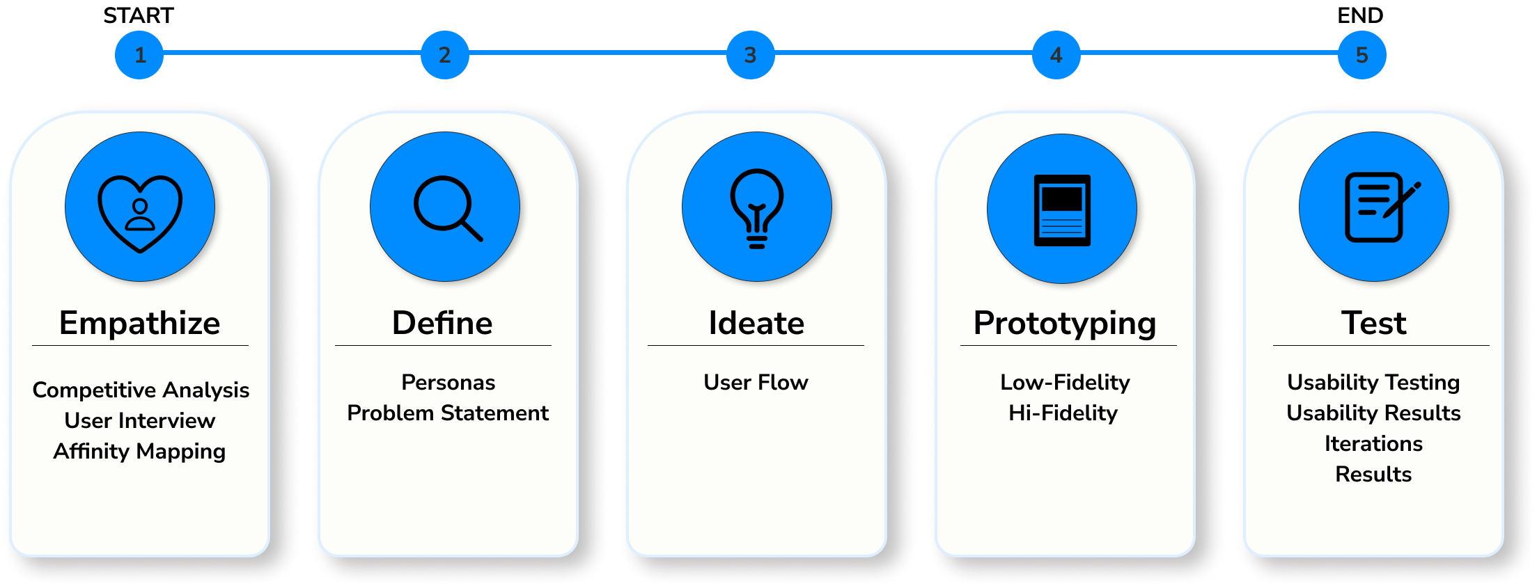
Emphasize • To understand the user, their needs, and their problem
Focus

The goal was to see if current users would value using the split the bill feature so we can decide if this is going to add a positive impact on users using Venmo and to also gain deeper insights to discover what the users needs and pain points are.
Objective
Determine what goal having a split the bill feature accomplishes.
Understand how using split the bill would fit into their life.
Understand how it will be helpful or benefit users.
Understand types of situations that would warrant users to use the splitting the bill feature.
Research
FigJam’s template was used to assess and analyze direct and indirect competitors’ products, customer base, strengths and weaknesses.
Competitive Analysis
Key Points:
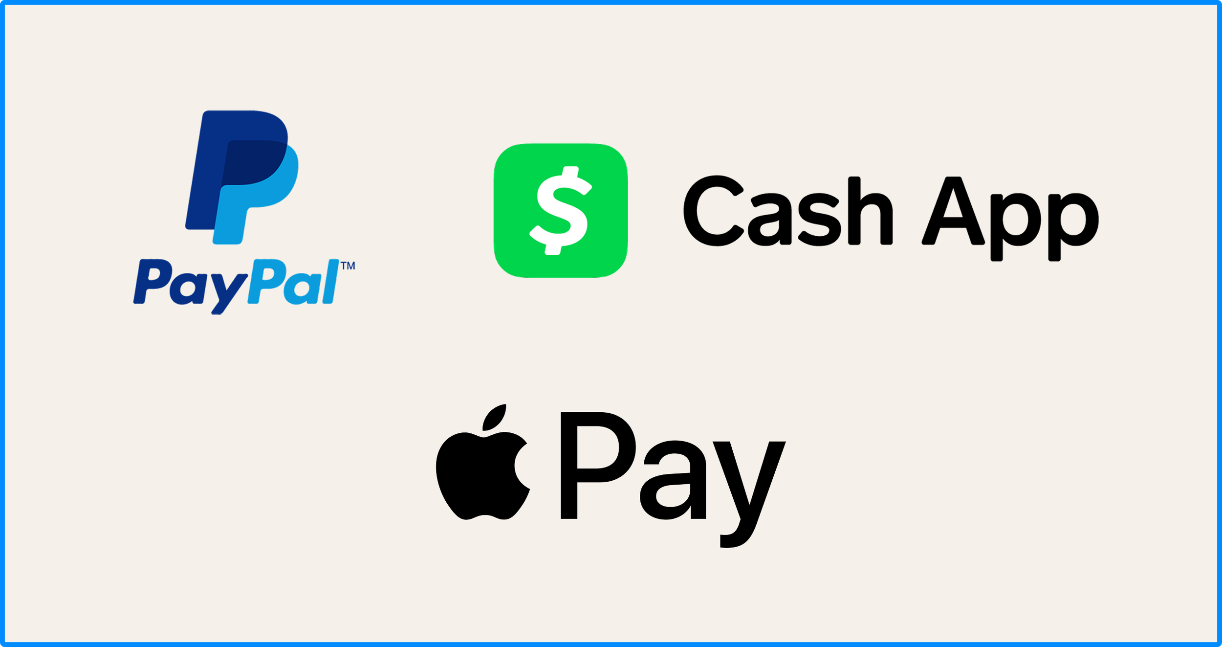
PayPal, Cash App, and Apple Pay mainly focuses on providing convenient and simple peer to peer and/or merchandise transaction domestically or internationally but some with foreign transaction fees or with limited foreign functionality.
A noticeable trend among these apps offers rewards to entice customers to encourage ongoing use of their app, offers basic split bill among peers functionality, and splitting of purchase into installments.
All primarily targeting 18 and over, PayPal offers more broader range of services, Cash App focuses more on banking features and peer to peer transactions, and Apple Pay focuses more on mobile payment service for in person, in app, and online purchases.
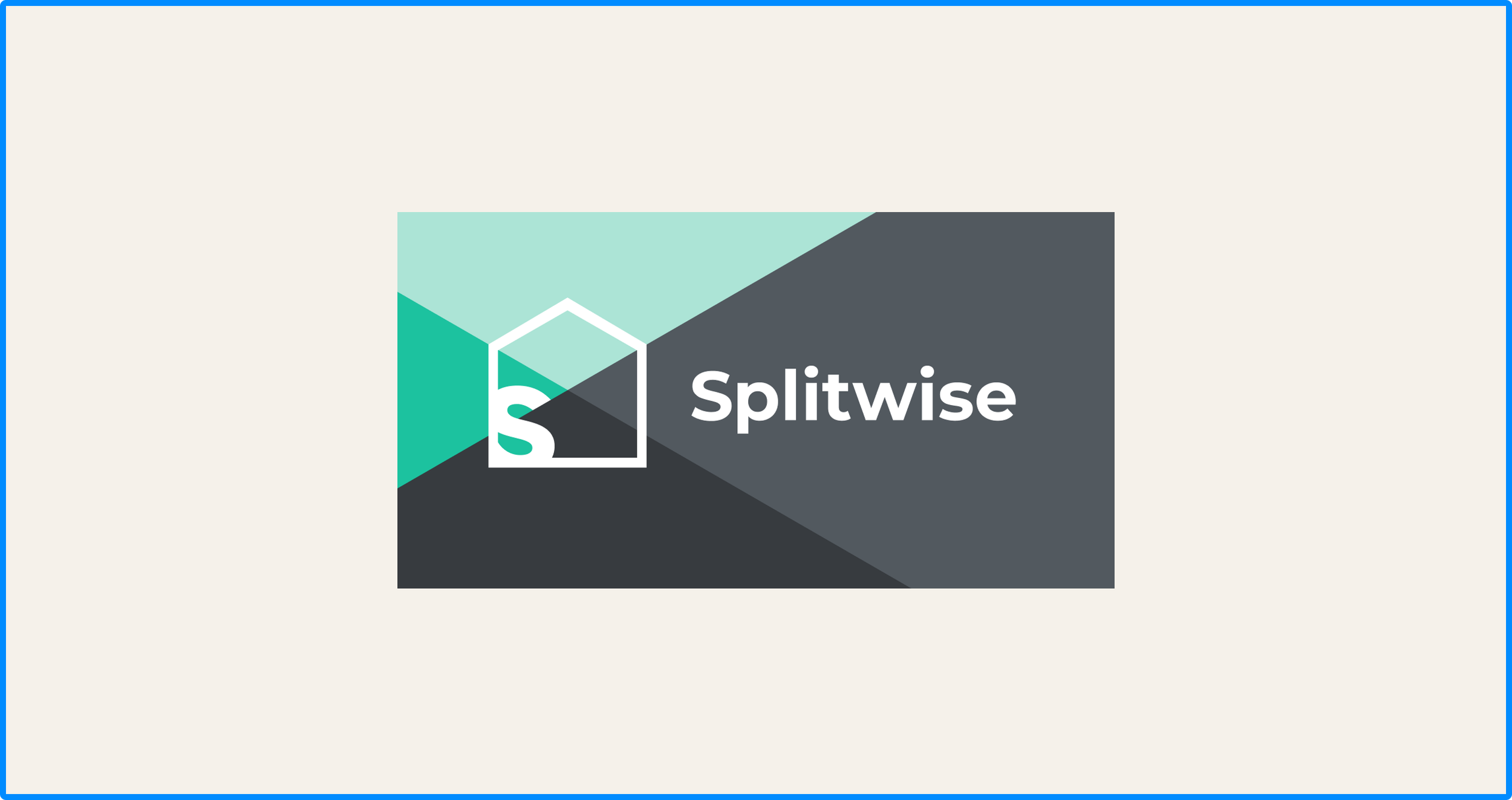
Secondary Analysis
Key Points:
Splitwise offers further detail on splitting the cost between peers with the main goal of reducing the stress of sharing expenses.
Some of the main features are the offerings of calculating total balances simplifying debts, equal or unequal splits or by percentage or shares, and splitting the bill by itemizing the cost.
The downside of this app is that it doesn’t handle money transactions like Paypal, Cash App, and Apple Pay.
Opportunity:
A great opportunity for money transaction apps, is to provide a feature that allows for splitting the bills - not just equally, but an easy and flexible way that makes it easy to divide the costs however they want.
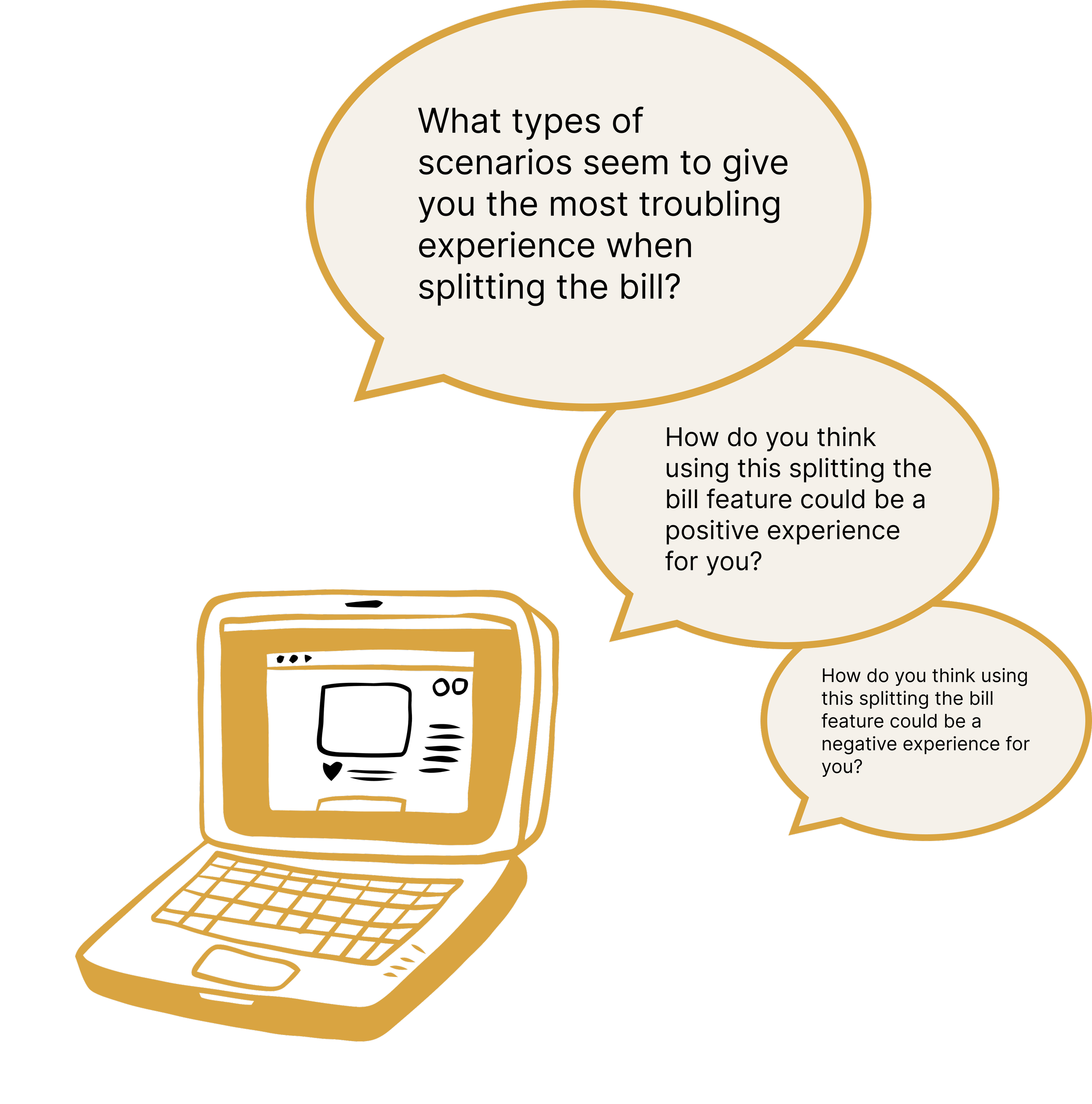
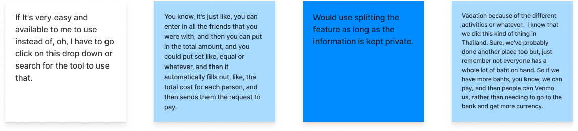
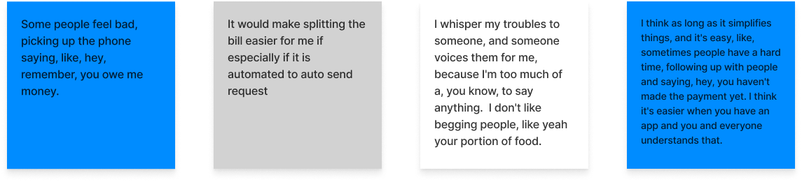
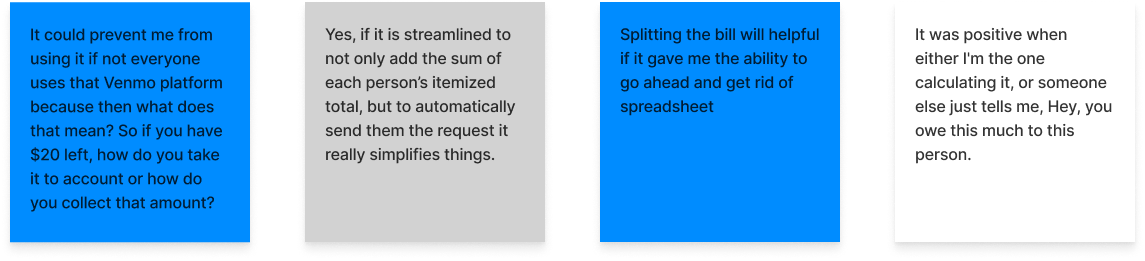
User Interviews
I conducted user interviews to gain a deeper understanding and to gain some insights to see whether users would value using the split the bill feature. The feature would allow users to upload or scan a receipt and allow users to assign calculated total cost to the group.
Participants
I interviewed participants in the following categories, being sure to include a range of age ranges 18+ or older, genres, and ethnicities in our target industry.
People who currently use Venmo.
People who routinely run into scenarios where they need to split a bill
Affinity Mapping
After gathering all of the data from user interviews and surveys, I categorized the data using affinity mapping.
Fair Shares

Simplification

Users needs when splitting the bill: Privacy, Currency, & Simple UI
Feelings that arise from requesting payment
Ensuring payment is made to the correct person

Users needs when splitting the bill: Access for non-Venmo users and Automatic Calculations
Key Findings
It’s important to users:
That each individual is charged a fair cost
Tips and tax counts towards each individual’s cost
To split the bill without it causing any problems
Users concerns:
Some people feel uncomfortable reminding people that they owe money
Some people might not have their notification turned on therefore will not receive the notification that an amount is still owed
Splitting the bill with non-Venmo users
Payment is made to the correct person
Users would be more inclined to use the splitting the bill feature
Traveling
Splitting a bill with large groups
House expense
Dining
What would help users when using the splitting the bill:
Automatic calculations
Simple user interface
Privacy
Currency converter
To include non venmo users
Define • Synthesizing research to define the problem…
Personas
After research, this led me to 3 personas to know who the target users will be to effectively incorporate a new feature keeping these personas in mind.

Problem Statement
POV 1
I’d like to explore ways to help travel enthusiasts who frequently find themselves splitting multiple bills in foreign currencies, to accurately track multiple bills and convert currency to reduce complexities when determining how to split the bills.
HMW 1
How might we design a solution to track multiple bills and convert currency?
POV 2
I’d like to explore ways to help social gatherers who occasionally find themselves splitting the bills with others to accurately split the bill correctly to avoid conflicts when they find themself in a scenario when the bill is not divided fairly.
HMW 2
How might we design a feature to accurately split a bill?
POV 3
I’d like to explore ways to help people who manage recurring expenses for a group of people to avoid any uncomfortable feelings that can arise when having to remind the people within the group that a payment is due.
HMW 3
How might we include reminders for payment without any feelings of uncomfortableness?
Ideate • Brainstorming and generating solutions to help those needs…
User Flow
To understand how users will interact with the website, a user flow was created for the following to show the paths users will take when completing tasks:
Splitting the bill
Users receives request to choose the items purchased to make payment

Prototype • Create wireframes and prototypes to visualize solutions…
Lo Fidelity Sketches
Low fidelity frames were created by sketching different screens for each key unique screens.
2 different screens for the itemized receipt
2 different screens for currency and upload receipt option
2 different options for adding non-venmo users
2 different screens for the confirmation page
2 different screens to edit assign items


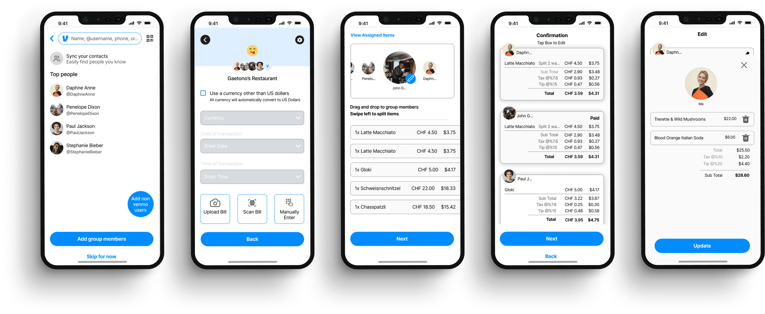
High Fidelity
5 key screens were created to emphasize the importance of these features that fulfills the users persona:
Adding a Non-Venmo User
Uploading/Scan a Receipt & Currency Converter
Assigned Items to User
Breakdown of Cost/Confirmation Page
Editing Items for Users Within the Group
Testing • Validate designs through user testing
Usability Test & Results
I conducted usability test via zoom involving 4 participants from the initial interview and 1 being a new participant to complete 3 different key tasks:
Task 1
Splitting a bill to assign items to friends to request payment, including adding a non venmo user
Results:
2 out of 5 participants were confused on the section to upload a receipt
4 out of 5 participants were confused or didn’t like the “drag and drop feature” when assigning items to a person
3 out of 5, the instructions on how to split an item was unclear
All participants were able to add non venmo users without any problems
Task 2
Receiving notification to assign items to themselves to make a payment owed
Results:
2 out of 5 participants were unclear on what the edit button was for
3 out of 5 participants were able to assign items, since they had figured out how to do from task 1
1 out of 5 participant would like to see the percentage box highlighted more under the tip section part of the screen
1 out of 5 participant skipped the part that you have to choose your option on how to assign a group
Task 3
Results:
All participants successfully completed the task without any major issues
1 out of 5 participants wanted to be able to click the words next to the radio button instead of just the button for a faster flow
1 out of 5 participant noticed that there should be a monetary header on top of the card such as “USD” and to also use a swiss symbol instead
Splitting the bill to assign items to friends to request payment using the currency converter
Iterations
Iterations were made based on usability test with 3 levels of priority.
Priority 1
Selecting Items Page Editing Item, Tip Input, Option for Group
Added a “Back” CTA button in case users need to view the screen to look at the original receipt to ensure the accuracy of the transferred items and price for accuracy
Changed the color of the radio button for better contrast for better visibility
Highlighted the toggle button for the dollar sign and the percentage to emphasize which one is active
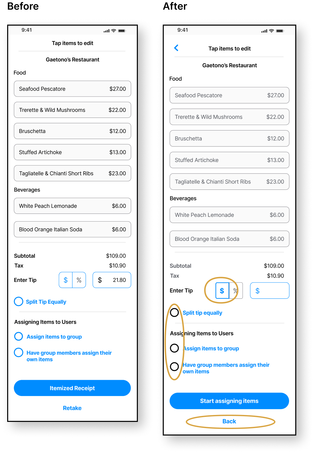
Priority 2
Assigning Items To John
Changed instructions since it is no longer drag and drop feature
Added a stroke to the image to let users know that John G is the active person at the moment to assign items
Also made the top area fixed to stay at the top when scrolling
Added “Back” CTA button in case users need to readjust options on the prior page

Priority 3
Selecting Items Page
Removed the pencil icon and added “Edit” CTA Button. Edit button appears once an item has been added to a member
Able to view what each individual has been assigned when selecting the items. The item box has also increased in size to fit the image of the person that it is assigned to.

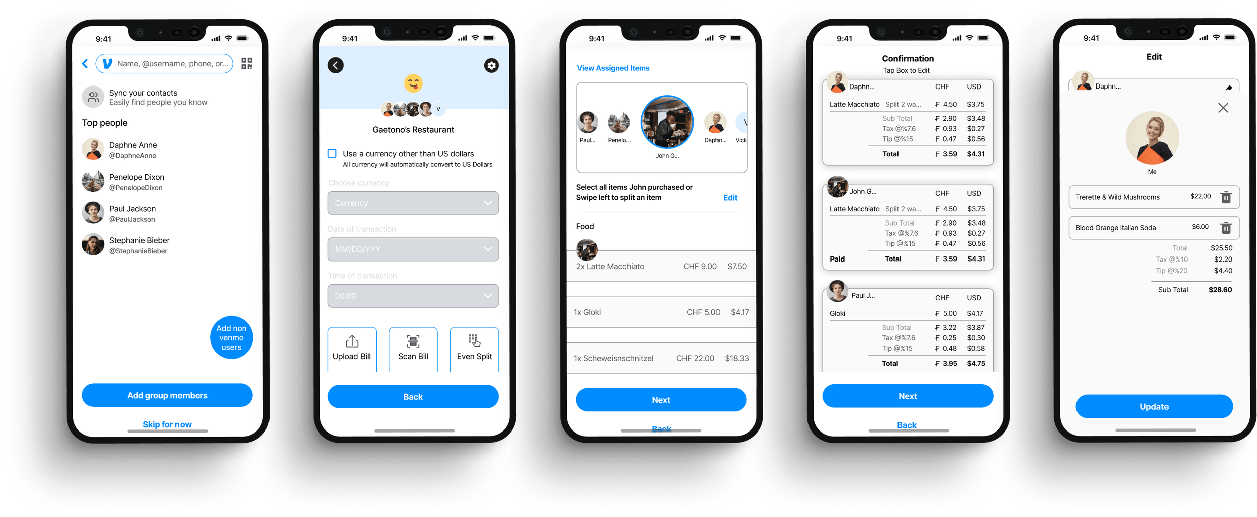
High Fidelity After Iterations
After usability testing, solutions were incorporated to problems participants encountered during the 3 task flows.
Splitting a bill to assign items to friends to request payment, including adding a non venmo user
Receiving notification to assign items to themselves to make a payment owed
Splitting the bill to assign items to friends to request payment using the currency converter
Results
Next Steps
Adding this new feature in Venmo, which allows users to upload or scan a receipt and assign calculated total cost of items including tax and receipt to people within the group to venmo which also includes non venmo users, I believe this solves the pain points of the personas. The complexity and problems that arises when it comes to splitting a bill such as feelings of unfairness if it’s not split fairly and headaches when trying to break down the cost especially when trying to split the bill in large groups, this feature would simplify splitting the bill for users and also make it convenient to be included on Venmo that already handles peer to peer transactions.
Now, the next steps would be to find participants for further usability tests on the final iterated design to ensure no further iterations will need to be made. I would also create UI Kit for developers since new content on the pages were created for adding a new feature.
Reflections
This project was challenging as it really required me to really think at a high level. It definitely pushed me to learn more about figma so that I can portray what I wanted to create. It pushed me to think critically and analytically to design a feature for users for possible different scenarios. I also learned that there are many ways I can be more efficient to work through some of the stages more quickly to be able to move forward through the many steps that need to be taken and to really focus on the important details of the design. The main challenge I encountered during the process of this project is designing the screens and steps for the users, particularly where they needed to assign items. Every time I thought I found a solution, another variable came to mind. It definitely took some time to find the best balance and possible design idea to fit the user’s needs. All in all, this experience will better equip me to adapt to many different challenges that as a UX Designer may encounter.